Deconstructed Remodel: Rustic yet Elegant Master Suite

This was such a fun remodel to do…
When I first met this young, stylish couple at their house they had a small handful of items they knew they really wanted in their master bathroom: a freestanding tub, a chandelier, a larger shower and more counter space. But the truth was, the bath needed a major face-lift.
BEFORE:
The room was rather large, but you would never know it because the tub deck consumed a significant portion of the space. Additionally, the shower felt claustrophobic, completely walled-in. And although the vanity cabinetry had room for two sinks, the remaining counter area was tight. The impracticality of the design and layout was only made worse by the lack-luster finishes. The space was outdated and lacked personality. It certainly didn’t reflect the homeowners and their elegant aesthetic.
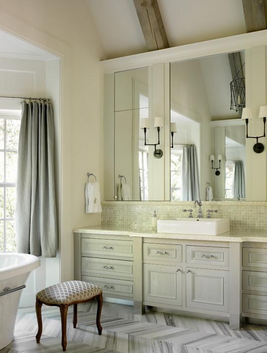
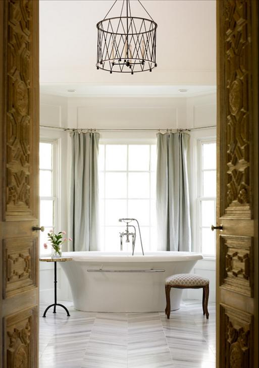
What made this space fun to design was that they had found a clear inspiration. This Master Bathroom:
designed by Liz Williams Interiors. Though a bit larger, it had a classic yet comfortable ambiance that the couple fell for. And I had to agree. The space was beautiful. Yet there was one major hurdle to cross: budget. The inspiration space had finishes that were well above what these homeowners wanted to spend.
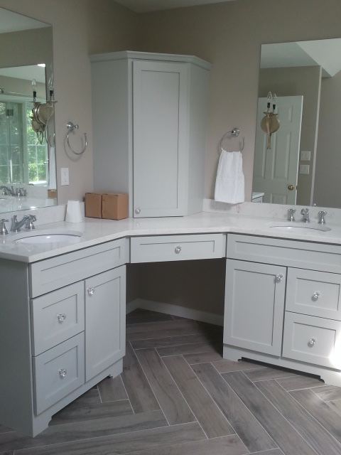
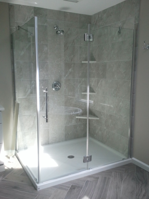
Sitting down to review the floor plan, I realized we could accomplish everything the homeowners wanted without moving the major fixtures in the bath. This makes for a speedier, easier remodel. To accentuate the dimensions of the room, the new freestanding tub was placed at an angle in the corner, across from the new l-shaped vanity and make-up area in the opposite corner. Removing the unnecessary third wall of the shower not only allowed us to increase the size of it, but also opened it up to let natural light fill the entire space, uninterrupted.
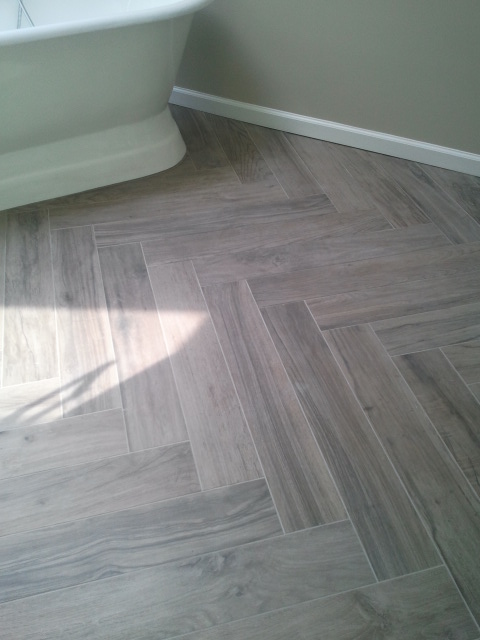
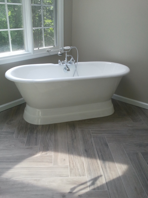
Pulling from the inspiration space a herringbone pattern was chosen for the wood-look floor tile. This is a more affordable option than the chevron used in the inspiration and yet it creates a similar effect. In the shower, rather than covering the walls with a mosaic, we chose a single vertical mosaic accent. Again this is a more affordable option, but it also accents the height of the ceilings and will be easier to maintain because it requires less grout. Complimenting both the glass mosaic and the wood-look floor tile is an affordable stone-look porcelain. The combination of the stone and wood lends just enough of a rustic flair to bring a little bit of the outdoors in and helps to balance some of the feminine elements in the room with simple masculine touches.
For the vanity, attention to small details goes a long way, like the decorative toe cut-out. The soft grey-blue painted cabinet receives a light-colored quartz countertop. While the quartz is made to look like marble, it is a more practical, maintenance-free solution that comes at a better price point than the onyx found in the inspiration room. And for the icing on the cake, we found a petite chandelier and matching sconces that echoed the airy feeling of the inspiration fixture. Just the right finishing touch.
INSPIRATION:
MY DESIGN:
“The Icing on the Cake”
DURING:
Just look at that beautiful herringbone!
Getting a cast-iron tub into a second floor bath….
And the shower door goes in!
And finally… AFTER:
Still needs a couple finishing touches. Shades on the sconces, mirrored door on the corner make-up cabinet, but we’ve come a long way.
I’ll update when I’ve got final pics.
And thanks Liz for the gorgeous inspiration!
UPDATED PICTURES:
Rachel | rejpinteriors.com






Comments
One Response to “Deconstructed Remodel: Rustic yet Elegant Master Suite”Trackbacks
Check out what others are saying...[…] important as knowing what you do want. I’ve had clients pull their inspiration entirely from a favorite remodel they found on […]